In today's digital landscape, users expect seamless online experiences for essential tasks—from discovering new recipes to securing accommodations. This project addresses creating an intuitive hotel booking customer journey that drives both user satisfaction and business outcomes. The design solution balances two key objectives: delivering a frictionless booking experience that converts browsers into guests, while reflecting the luxury and sophistication that defines the brand.
To achieve these 2 key objectives, I needed to design and prototype a comprehensive hotel booking website for desktop that guides users through the complete booking journey—from initial homepage visit through to final booking confirmation. I wanted the interface to embody brand sophistication through strategic use of the established color palette, creating a premium user experience that reflects the property's luxury positioning.
This design will deliver several key benefits:
To address the business objectives, I analyzed competitor websites as well study user behavior patterns to identify the optimal booking journey. Research data indicates that desktop users demonstrate 8% higher conversion rates compared to mobile, with significantly lower abandonment rates during the booking process.
Starting with competitor analysis which will focus on simply cataloging what competitors were doing, I needed to identify both industry best practices worth adopting and common pain points that presented opportunities for differentiation. I examined the following hotel websites to identify where our design could both meet established user expectations and exceed them in meaningful ways:
To validate my design direction and uncover authentic user behaviors, I conducted moderated usability sessions with real users navigating competitor booking platforms. This research aimed to identify friction points in existing solutions while observing natural user patterns that our design should either support or strategically redirect.
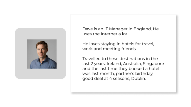
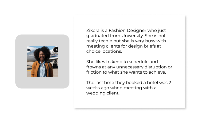
The following users profiles participated in the research sessions:
Key takeaways from moderating these sessions revealed the following themes:
Simplicity and Connective Flow between critical pages needed to complete a booking
Simplified Room Comparison while on the same page
Lots of clear pictures
Intuitive options to select or change currency and language
Like to see reviews specific to a room
There should be a call to action for every room type
Visible option to contact customer service or clear contact details on home page
Navigating through the website should be easy to understand
Building insight from outcomes of both competitor analysis and usability testing, my design strategy for the 1st phase using the MosCow technique focuses on the following:
By streamlining the workflow and removing unnecessary steps, the solution aims to capitalize on desktop users' higher booking intent while further reducing drop-off rates.
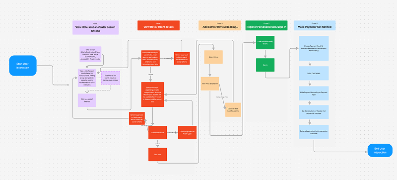
The overarching scope of this project is a defined happy path that will get the customer started from the homepage hotel search, browse search results, see property details, room selection, guest information, payment processing, and booking summary screens.
I'm now thinking the booking workflow would follow a logical progression:
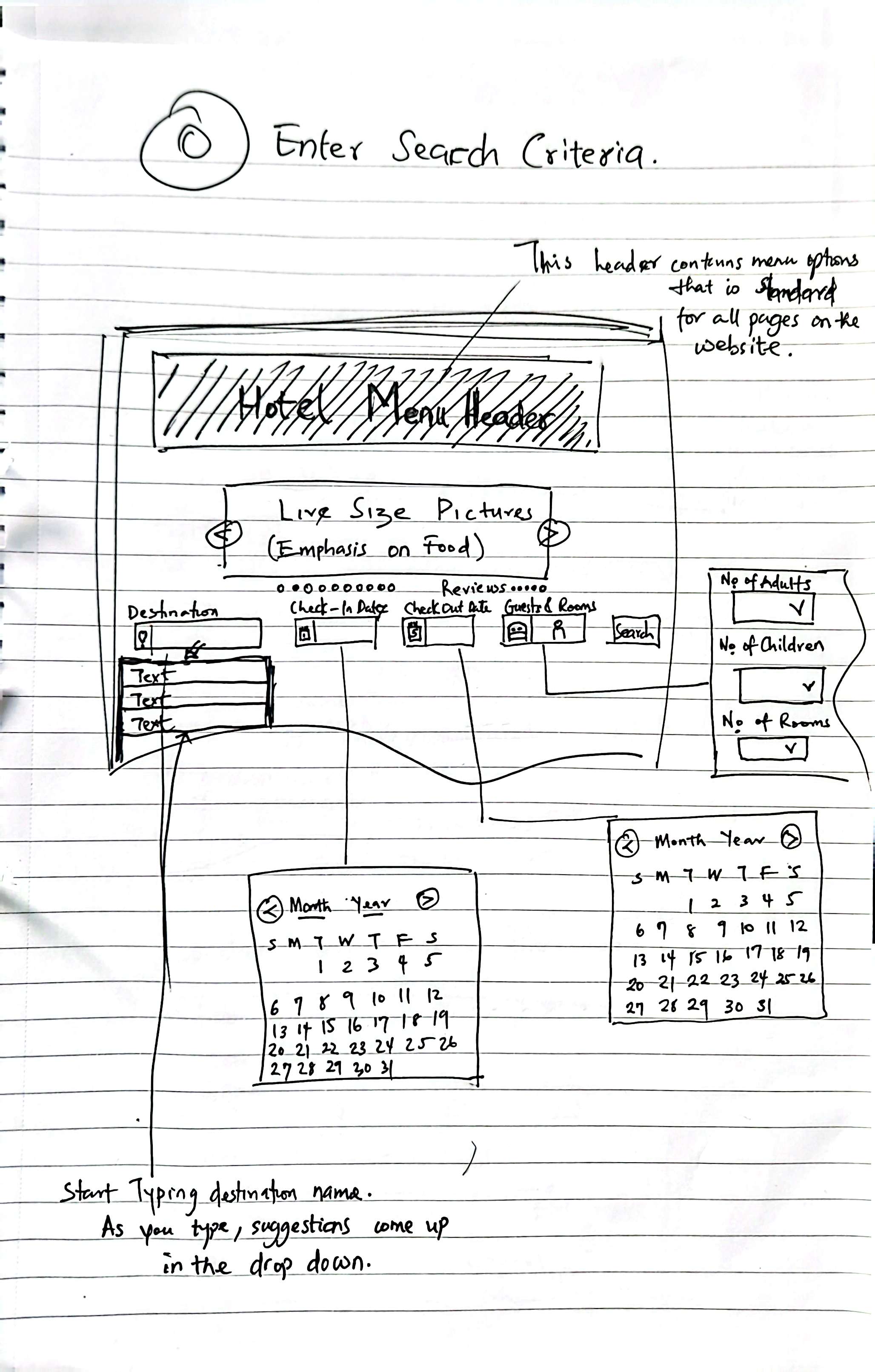
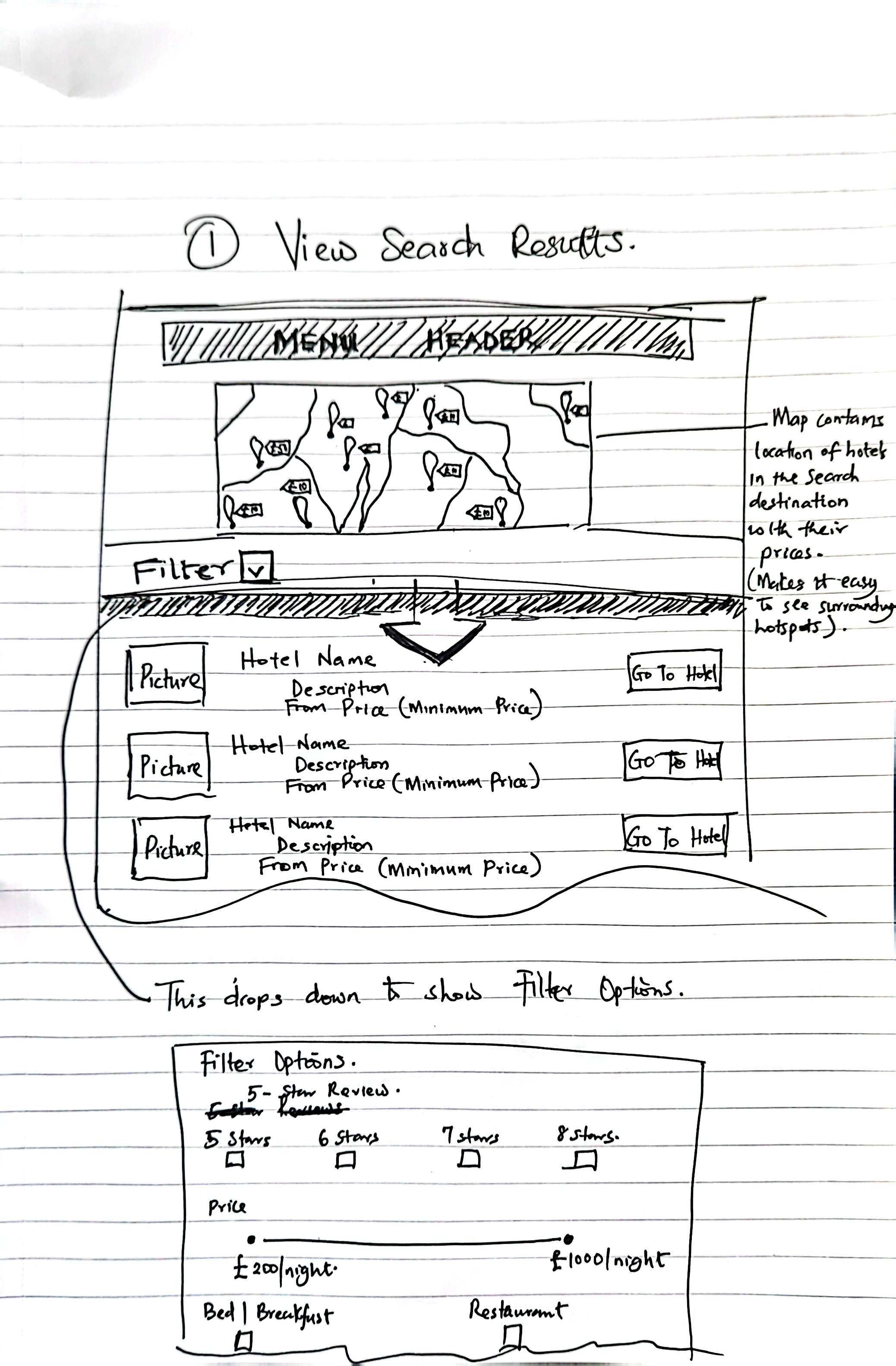
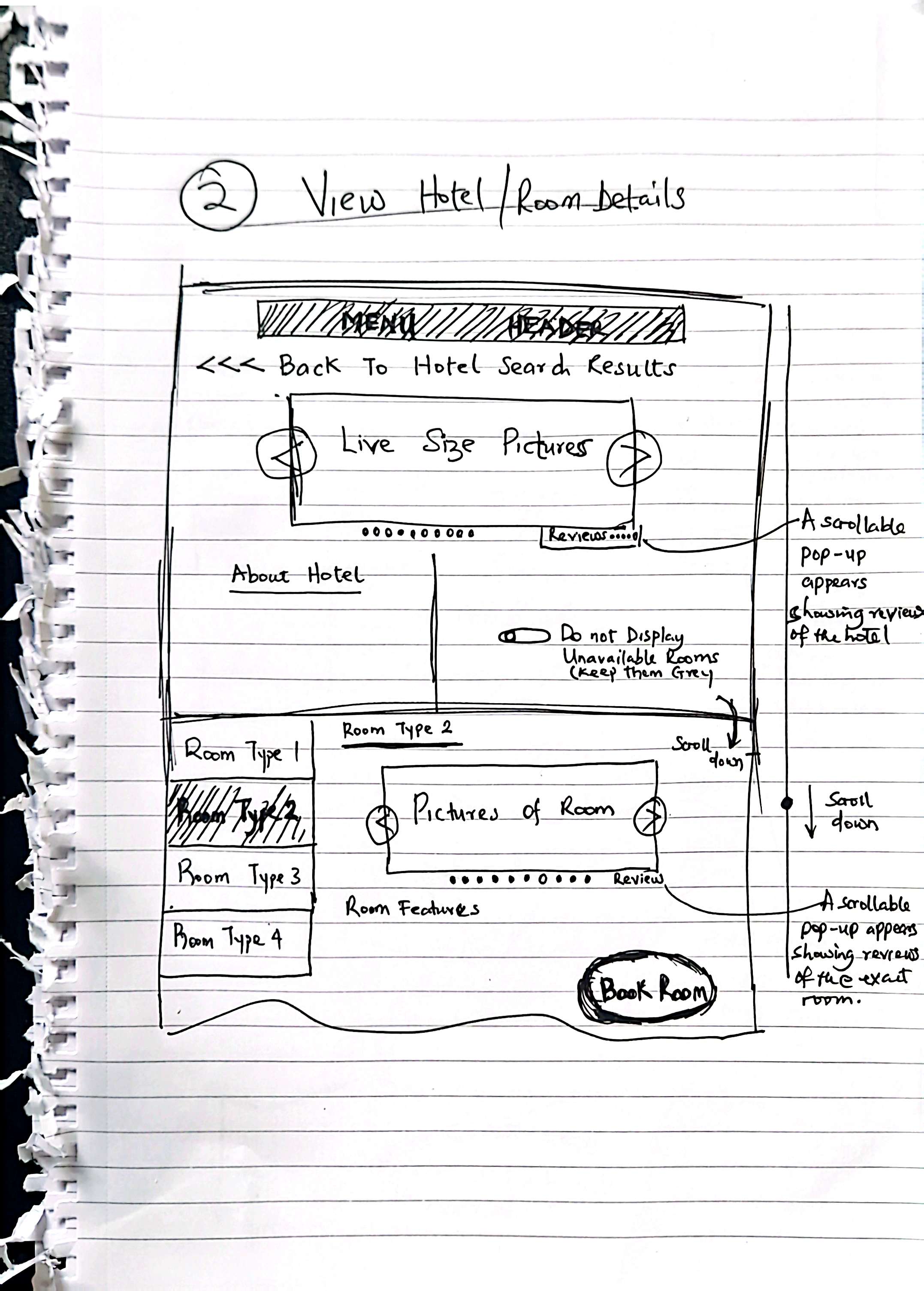
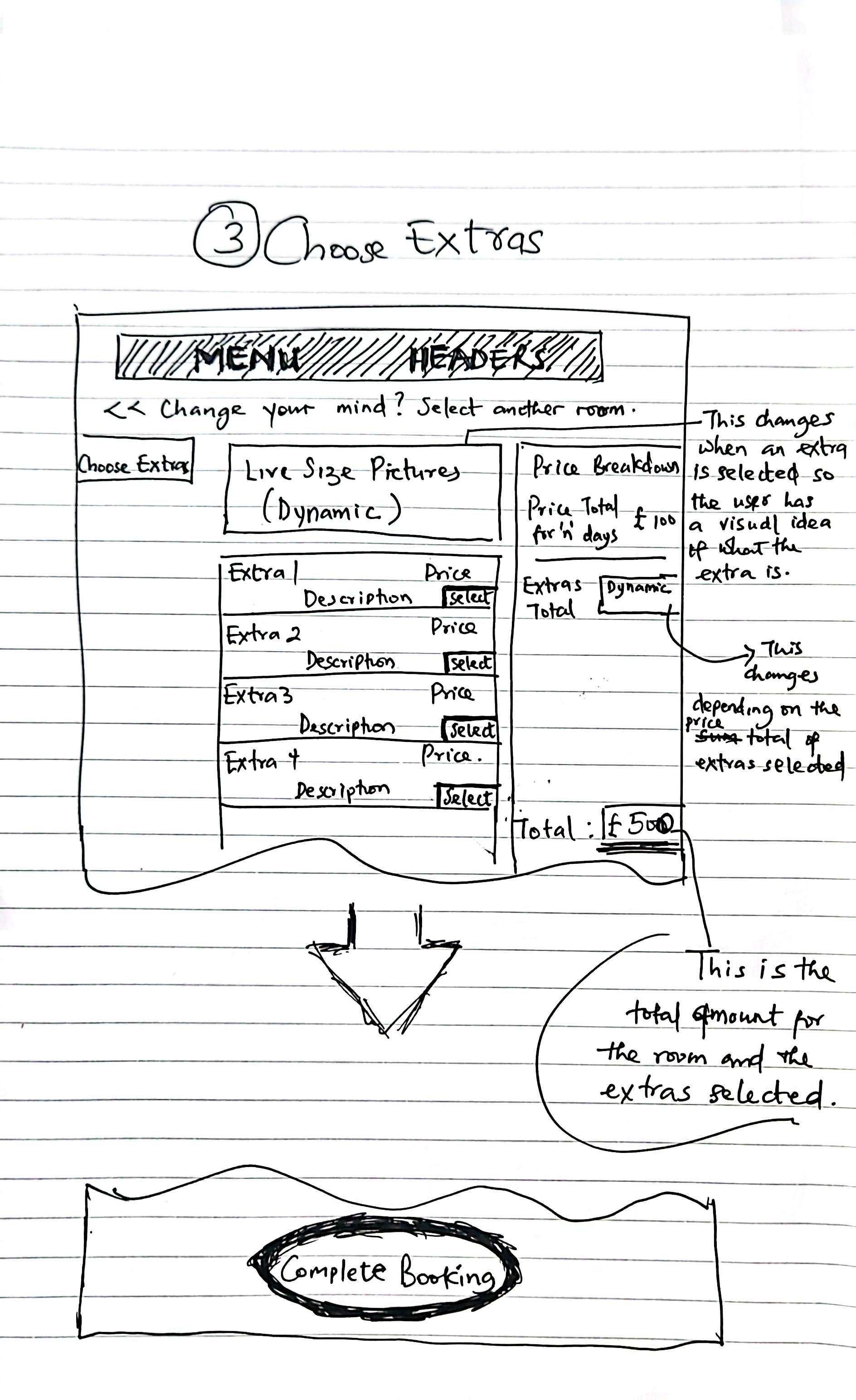
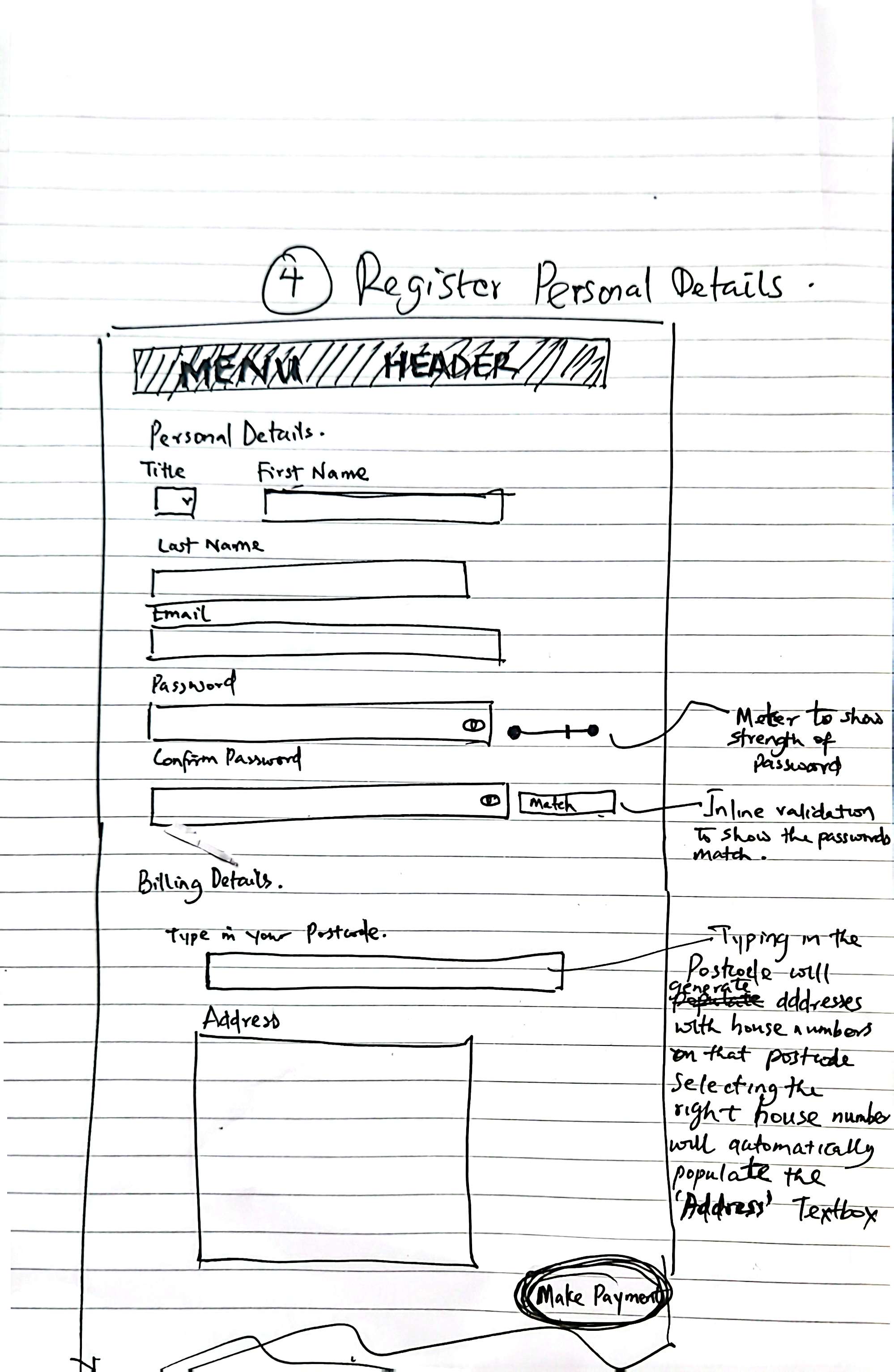
Using pen and paper, I did a few sketches of what I thought could be a good starting point given insights gotten from the research I did.
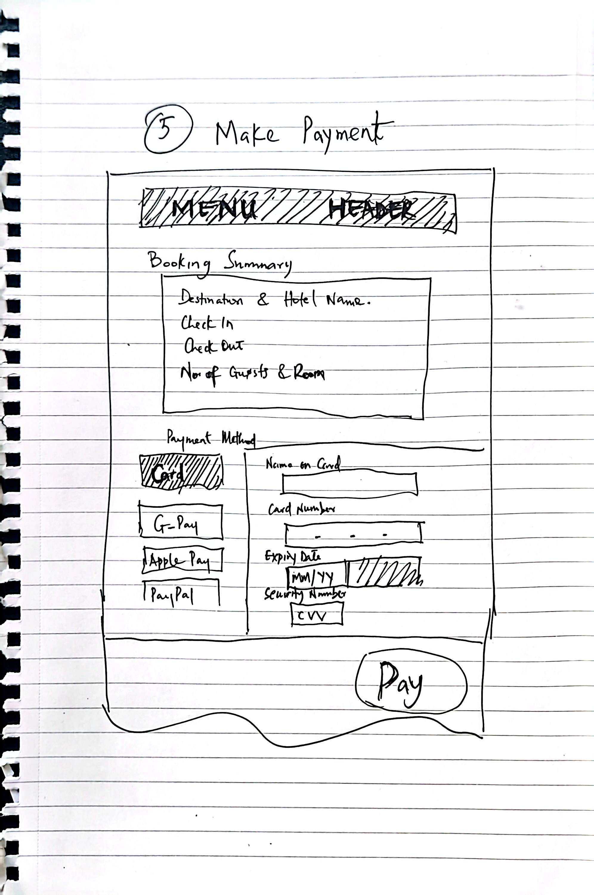
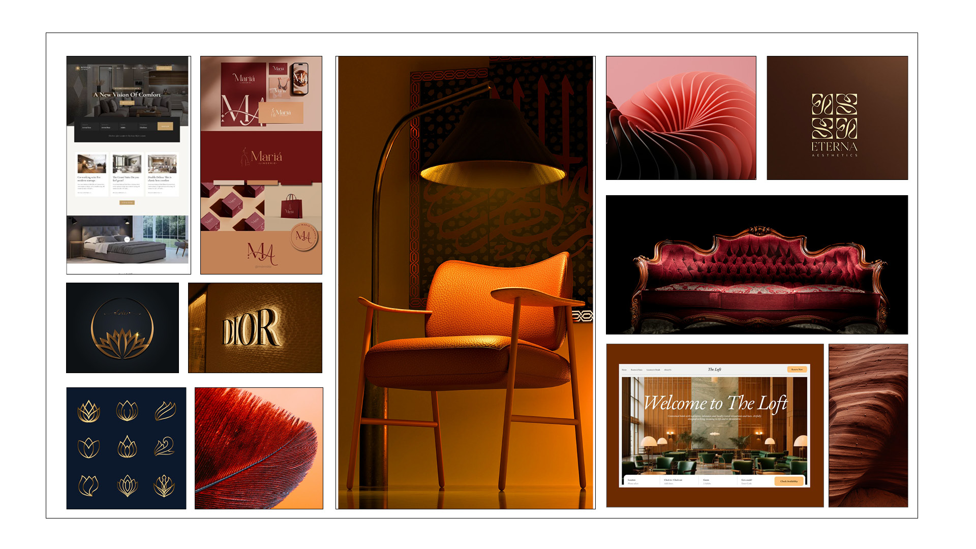
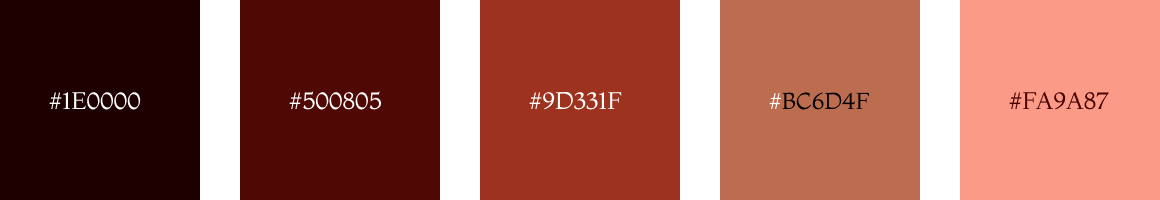
I thought to incorporate a sophisticated color scheme that anchors the design, featuring deep maroon as the primary color complemented by refined copper and gold accents. The lotus flower logo reinforces themes of luxury and transformation. This cohesive branding establishes instant recognition and builds user confidence across every touchpoint.
The Logo Name is set in Cinzel Decorative which brings an elegant, sophisticated feel. Smaller headings, label and body text are formatted with Montserrat throughout the site. This ensures excellent readability and clean presentation. Together, these fonts create a harmonious pairing that feels refined rather than cluttered.
Images will be finalized before launch, but I've used examples with warm, sophisticated accents to demonstrate the design concept.
Icons in this design serve to highlight key features and reinforce descriptive text. They are static elements that do not change state when interacted with.
Following prototype development, I conducted a second usability test to gather comprehensive feedback on website functionality and user experience.
Patterns noticed after conducting a second usability test using the same test script used in the first usability test showed the following:
Users were able to complete the booking journey under 2 mins.
They mentioned not needing to scroll so much to get necessary information needed to make a decision.
It was easy to compare room types without leaving the page.
Users will like to select their payment type or indicate if they would like to make a deposit instead of a full payment.
With the above results, I was sure the needs of the users were identified taken into consideration during the design implementation. Of course, there is always room for improvement which I look forward to. However with this result, I'm confident this good to ship while preparing for the second phase...
I'm excited to contribute to designing the next version of this website. This project taught me valuable lessons about accessibility's crucial role, and I'll prioritize these considerations from the very beginning of the design process in all future projects.
.gif)